Flex Your Layouts: A Comprehensive Guide to Flexbox in React Native with Code Snippets

"Tech enthusiast, and blogger, sharing my knowledge and experiences in the ever-evolving tech world. Join me as I explore the latest advancements and trends in web development, mobile app development, and cloud computing. Let's learn and grow together!"
Flexbox is a popular layout framework in web and mobile app development. It enables flexible and responsive layouts, making it a crucial tool for creating modern user interfaces.
What are we going to learn?
In this article, we'll explore the basics of flexbox in React Native and provide code snippets for each attribute or property and the outputs as well.
What is Flexbox?
Flexbox is a layout concept that uses a set of parameters to generate flexible and adaptable layouts. You may effortlessly arrange and distribute elements within a container with flexbox, regardless of their size or content. There are two primary components in a flexbox layout: the container (also known as the flex container) and the items(also known as flex items). The container holds the items and governs their placement and spacing.
Flexbox operates the same way in React Native as it does in CSS on the web, but there is a catch, and before I go any further, I want you to keep a number of exceptions in mind. The defaults are different as
flexDirectiondefaults tocolumninstead ofrow.alignContentdefaults toflex-startinstead ofstretch.flexShrinkdefaulting to0instead of1.flexparameter only supporting a single number.
Flexbox properties
Flex
The flex property determines how items grow or shrink to fill available space within the container. By default, all items have a flex value of 0. You can set the flex value to a positive number to allow items to grow, or a negative number to allow them to shrink.
// Try setting `flexDirection` to `"column"`.
    <View style={[styles.container,{flexDirection: "row"}]}>
      <View style={{ flex: 1, backgroundColor: "red" }} />
      <View style={{ flex: 2, backgroundColor: "darkorange" }} />
      <View style={{ flex: 3, backgroundColor: "green" }} />
    </View>
  );
};
const styles = StyleSheet.create({
  container: {
    flex: 1,
    padding: 20
  }
});

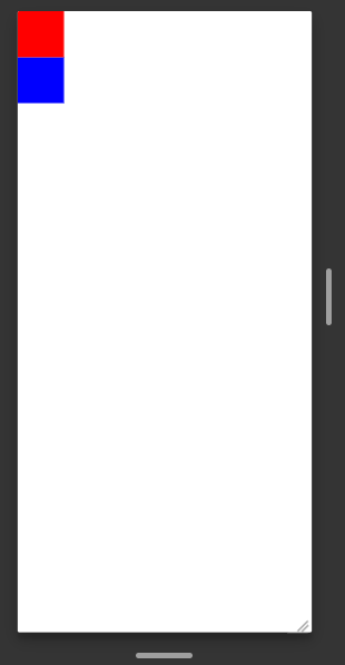
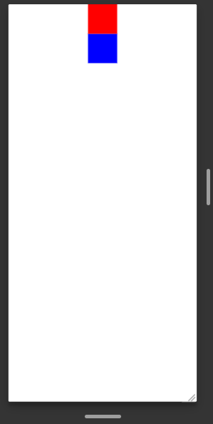
Flex Direction
The flexDirection property determines the direction of the main axis. It controls the direction in which the children of a node are laid out, by default, the main axis is horizontal. You can change this to vertical by setting the flexDirection property to column
const App = () => {
  return (
    //Try setting flexDirection: 'row'
    //Try setting flexDirection: 'row-reverse'
    //Try setting flexDirection: 'column-reverse'
    <View style={{flexDirection: 'column'}}>
      <View style={{width: 50, height: 50, backgroundColor: 'red'}} />
      <View style={{width: 50, height: 50, backgroundColor: 'blue'}} />
    </View>
  );
};
Justify Content
The justifyContent describes how to align children within the main axis of their container. For example, you can use this property to center a child horizontally within a container with flexDirection set to row or vertically within a container with flexDirection set to column.
const App = () => {
  return (
    //Try setting justifyContent: 'flex-start' (default)
    //Try setting justifyContent: 'flex-end'
    //Try setting justifyContent: 'center'
    //Try setting justifyContent: 'space-around'
    //Try setting justifyContent: 'space-evenly'

    <View style={[styles.container, { justifyContent: "space-between" }]}>
      <View style={{ width: 50, height: 50, backgroundColor: "red" }} />
      <View style={{ width: 50, height: 50, backgroundColor: "green" }} />
    </View>
  );
};
const styles = StyleSheet.create({
  container:{
    flexDirection: 'row'
  }
})

Align Items
The alignItems property determines how items are aligned along the cross-axis. You can align items to the start, center, end, or stretch to fill the container. It is very similar to justifyContent but instead of applying to the main axis, alignItems applies to the cross-axis.
const App = () => {
  return (
    //try alignItems: 'stretch'
    //try alignItems: 'start'
    //try alignItems: 'end'
    <View style={{alignItems: 'center'}}>
      <View style={{width: 50, height: 50, backgroundColor: 'red'}} />
      <View style={{width: 50, height: 50, backgroundColor: 'blue'}} />
    </View>
  );
};
Align Self
The alignSelf property determines how an individual item in a container is aligned along the cross-axis. This property overrides the alignItems property set on the container. This property overrides the alignItems property set on the container.
const App = () => {
  return (
    <View style={{alignItems: 'center'}}>
      <View style={{alignSelf: 'flex-start', width: 50, height: 50, backgroundColor: 'red'}} />
      <View style={{width: 50, height: 50, backgroundColor: 'blue'}} />
    </View>
  );
};

Align Content
The alignContent property in Flexbox is used to align and distribute the flex items along the cross-axis when there is extra space in the flex container. This property is used when the flex container has multiple lines or wraps its children onto new lines.
const App = () => {
  return (
//Also Try
//alignContent: 'space-around'
//alignContent: 'flex-start'
//alignContent: 'flex-end'
//alignContent: 'center'
//alignContent: 'stretch'

      <View style={{ flex: 1, flexDirection: 'row', flexWrap: 'wrap', alignContent: 'space-between' }}>
        <View style={{ width: 50, height: 50, backgroundColor: 'red' }} />
        <View style={{ width: 50, height: 50, backgroundColor: 'blue' }} />
        <View style={{ width: 50, height: 50, backgroundColor: 'green' }} />
        <View style={{ width: 50, height: 50, backgroundColor: 'yellow' }} />
        <View style={{ width: 50, height: 50, backgroundColor: 'orange' }} />
        <View style={{ width: 50, height: 50, backgroundColor: 'purple' }} />
      </View>
  );
};

Conclusion
Flexbox is a useful tool in React Native for generating flexible and adaptable layouts. Using the characteristics described in this article, you can quickly construct a variety of layouts to meet the demands of your app.
Thank you very much for reading, I hope this article added some value to your developer life. ✌️


